
Alright, you’ve got Photoshop, now what? A lot of questions come up when you go to start your first project—how many pixels are enough pixels? Is there such a thing as too big or too small? What do all these other knobs and dials on the “New” dialogue mean?
I’ll walk you through everything you need to know to get started.
First, open Photoshop. (I’ll be using Photoshop CC 2020 on PC, but you can apply this info to most versions of Photoshop.)
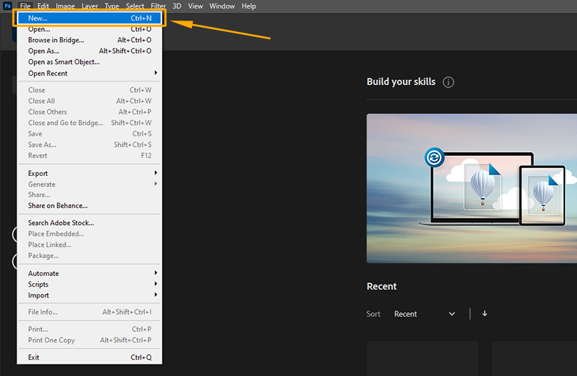
To create a new document, click “File” and select “New.” This will bring up the “New” dialogue.
The “New” dialogue is where all the magic happens. It can also be overwhelming. Let’s go top to bottom.
Name
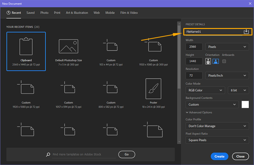
Use the name field at the top to name your file. When you go to save your file later, it will auto populate this name into the “Save As” dialogue. This is also nice to have if you have multiple Photoshop files open at once, to help you tell them apart, and also to help if you have to recover any files.
* You can skip this field and it won’t hurt you.
Preset & Size
The labels along the top lead to a huge selection of canvas presets. They range across multiple standard uses, from photos to web design. This is a new feature in recent versions of Photoshop, and it’s worth exploring them.

Sometimes I use “Letter” under “Print” to get a quick start. However, it’s easy and more flexible to choose your own document settings.
Width, Height, and Units
The most common question I get is “how big should my canvas be?”
When you’re planning the size of your file, you should first think about the future. If you might someday want to print this out, you’ll want to future-proof the canvas size to match the biggest print you plan on making.
Keep this rule in mind: you can always size down, but you can’t size up.
This means that you want to work at the largest size possible. But wait! Don’t go making a 10,000 by 8,000 pixel canvas—Photoshop file size has a significant impact on performance. If you’re using a large canvas and a textured brush, when you make a brush stroke it will lag significantly.
So how do you decide what size to work at?
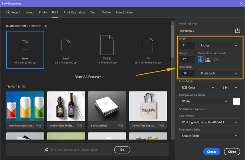
Simple. Figure out how large you want to print and work backwards. The largest I normally print is 11″ by 17″, so let’s calculate from there. In order to print correctly, there are a couple other settings you’ll need.
For now, input 11 for the width or height, and 17 for the other dimension. Be sure to choose “inches” from the drop down.
Resolution
The industry standard for art prints or photographs is 300 dpi (dots per inch), or in this case, “pixels/inch.” (A side note: large posters or banners are usually less dpi.) I’m going to repeat this because it is super important: make sure your resolution is no lower than 300. You can work higher, but don’t go lower. These days, some printers can even print at 150 dpi, but they are the exception, not the rule.
But wait, why use inches instead of pixels?
Absolutely set up your canvas size in pixels if you are more comfortable with them. Just make sure you fulfill this simple rule:
pixels / 300 = inches in print
If you make a canvas that is 300 pixels x 300 pixels, the largest you can print is 1 inch by 1 inch. If you make a canvas that is 3000 pixels x 3000 pixels, you’ll be able to print 10 inches by 10 inches.
Color Mode
This is another factor that impacts printers. Most Blank Document Presets have a default of RGB. That stands for Red/Green/Blue. RGB is how monitors display color, and it has to do with light. (Google additive color to learn more!)
The other potential color mode is CMYK. That stands for Cyan/Magenta/Yellow/Key. (Key is black.) These might be familiar if you’ve ever put an ink cartridge in a printer. These are the colors that printers mix to create all other colors.
RGB vs CMYK.
The main difference between RGB and CMYK is that RGB allows you to paint in colors that printers cannot reproduce. (These colors are mostly in the ultra-violent/magenta area.)
I used to recommend everyone work in CMYK from the beginning.
When you choose CMYK, you are setting your painting to use colors reproducible by printers. This means when you go to print, your colors will be more likely to match what you saw on the screen. Like with dpi, there are new printers that work well with RGB, but they are not that common yet.
CMYK limits the colors in your document, so you’ll notice a few less colors, but not by much.
But recently I have found myself working in RGB more and taking the risk of converting to CMYK at the end. But if you do this, be aware you may notice some color distortion happen in that process.
If you are planning to do prints, if you know what printer or printing service will produce them, you can find out if RGB is okay ahead of time.
Background Contents
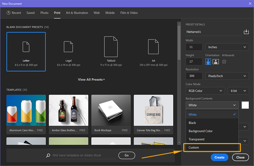
This setting controls what’s on the canvas to start. It’s set to “White” by default. When you’re doing any kind of painting or rendering that will involve light and shadow, I recommend starting on a 50% gray backdrop.
A 50% gray backdrop gives you one major advantage: it helps you avoid the optical illusions of color and value. Colors change based on what they are next to, so if you work on a white background, all your colors will appear darker than they actually are.
To set your background to 50% gray, choose the “Custom” option from the drop down. This will bring up the color picker window. If you want an exact 50%, enter 50 in the B text box in the H, S, B grouping (as shown above.) Let’s be honest, you can start with any color that pleases you!
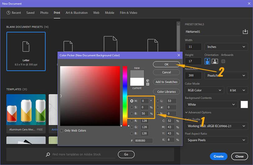
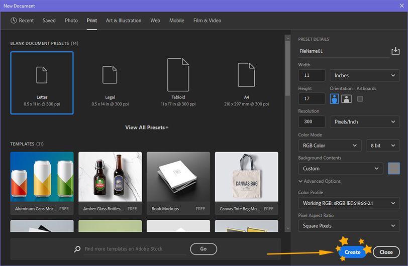
Once you’ve chosen your color, it will show up in the “Background Contents” area.
*It’s okay to skip this step, you can just use the paint bucket tool once you’ve made your document.
In general, it’s okay to ignore the Advanced settings. If you’re working with a specific printing service, they may prefer a specific Color Profile.
Voila
There you go! You’ve got your first Photoshop document ready to turn into a masterpiece!
TLDR
If you’re in a hurry, the only settings you need to change are the Width, Height, Resolution, and Color Mode. You can ignore the rest!
Good luck and happy painting!